Senior Product Designer
Two years in-house shaping a platform that shows Amazon sellers their sales, profit and reviews in one place — and helps them act on it faster.
Analytics and automation tools for Amazon sellersSellerise combines profit analytics, review automation, inventory and smart alerts for Amazon sellers. The product had grown feature by feature: screens were dense, tables hid what mattered, and onboarding lost new sellers before they even connected a store.
- UX research and analysis of seller workflows
- Information architecture and navigation
- Dashboards, tables and B2B interface design
- Design system with light and dark themes
- Prototyping and hand-off to engineering
- Chrome extension UX
What stood in the way — and how I solved it
Introduced a clear visual hierarchy, structured layouts and highlighted key metrics, with contextual guidance where decisions happen.
Fewer entry points, contextual hints and every big action broken into small, reversible steps.
Restructured columns, added filters and sorting, tuned density for readability and put the most important data first.
Sales & profit, at a glance
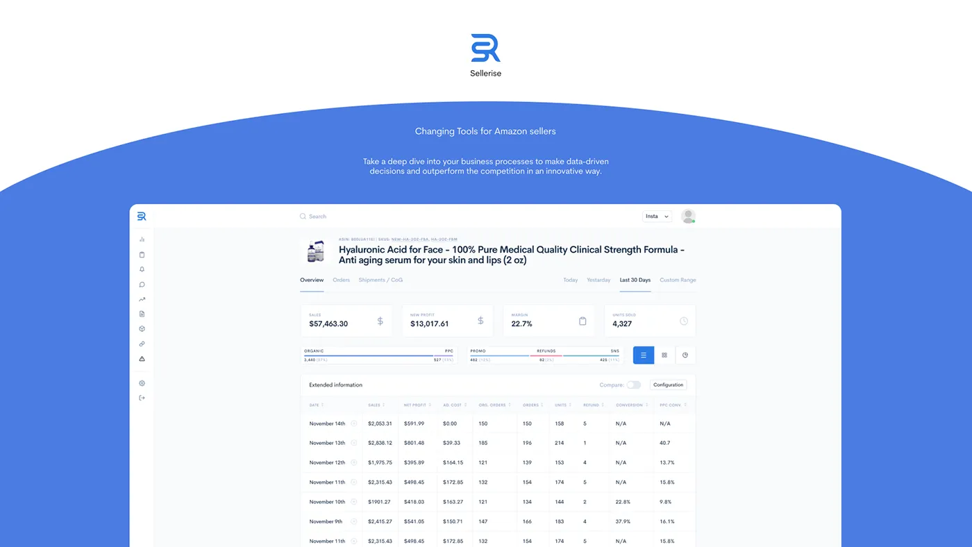
The home dashboard answers the first question every seller has in the morning — how much did I make, and what changed?
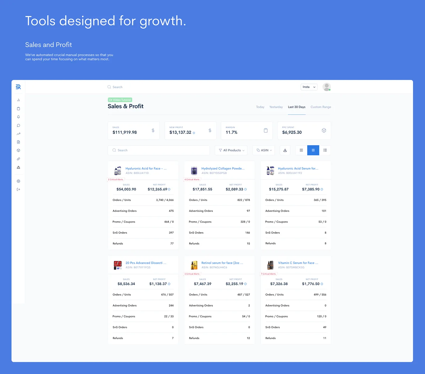
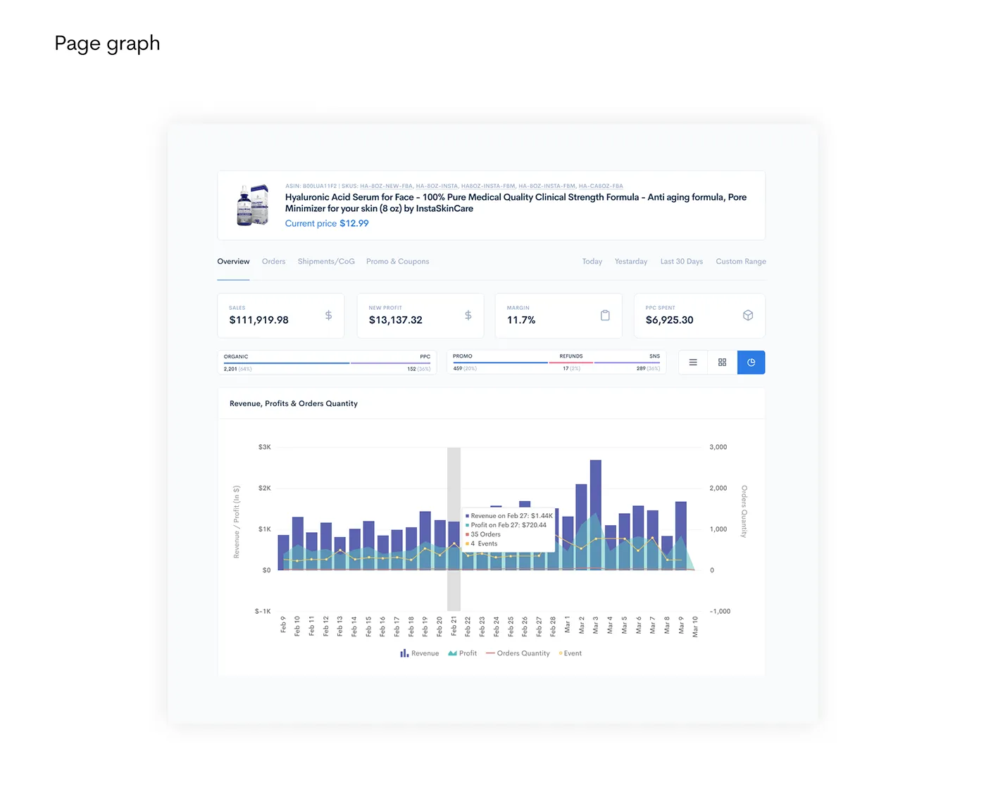
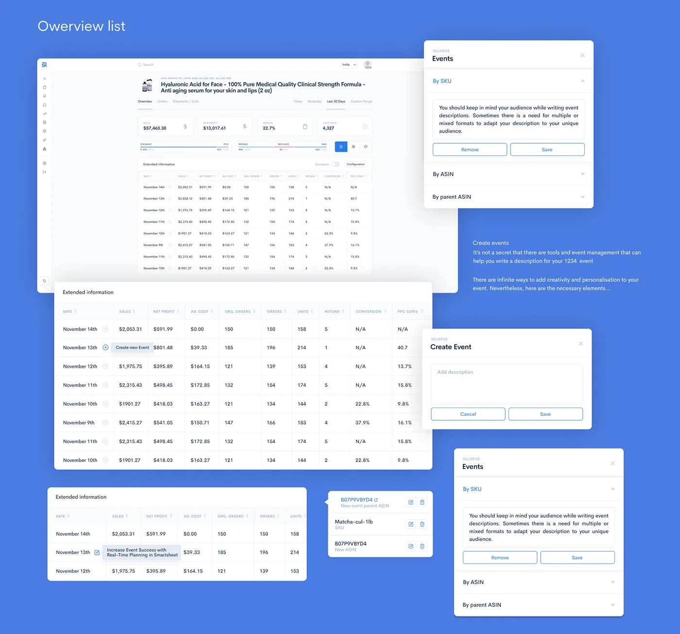
From trend to order in two clicks: the page graph and the overview list share filters and context.
Reviews without the busywork
Requesting reviews was manual and slow. I designed a review dashboard and a one-click flow — plus mass requests that run in the background.
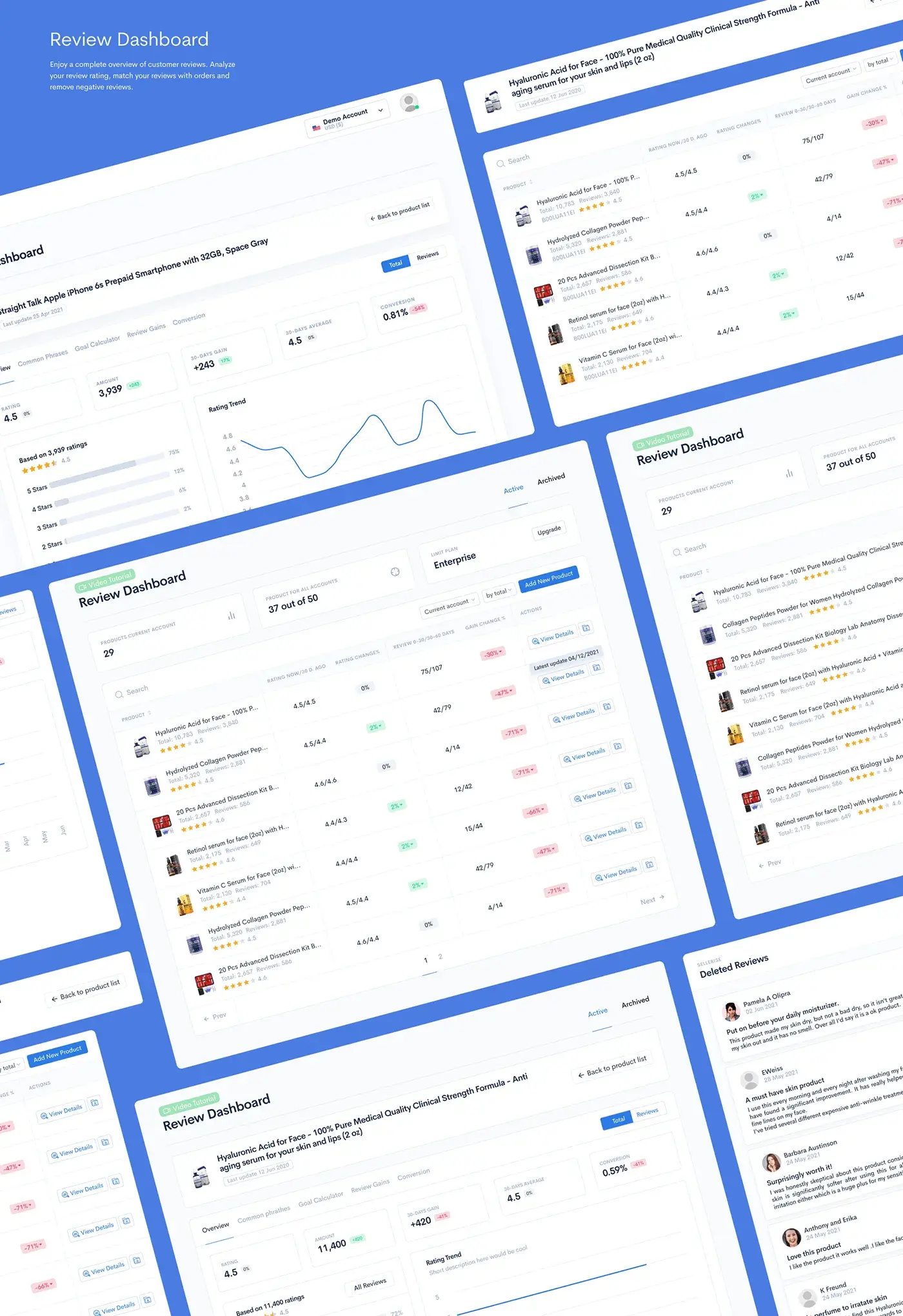
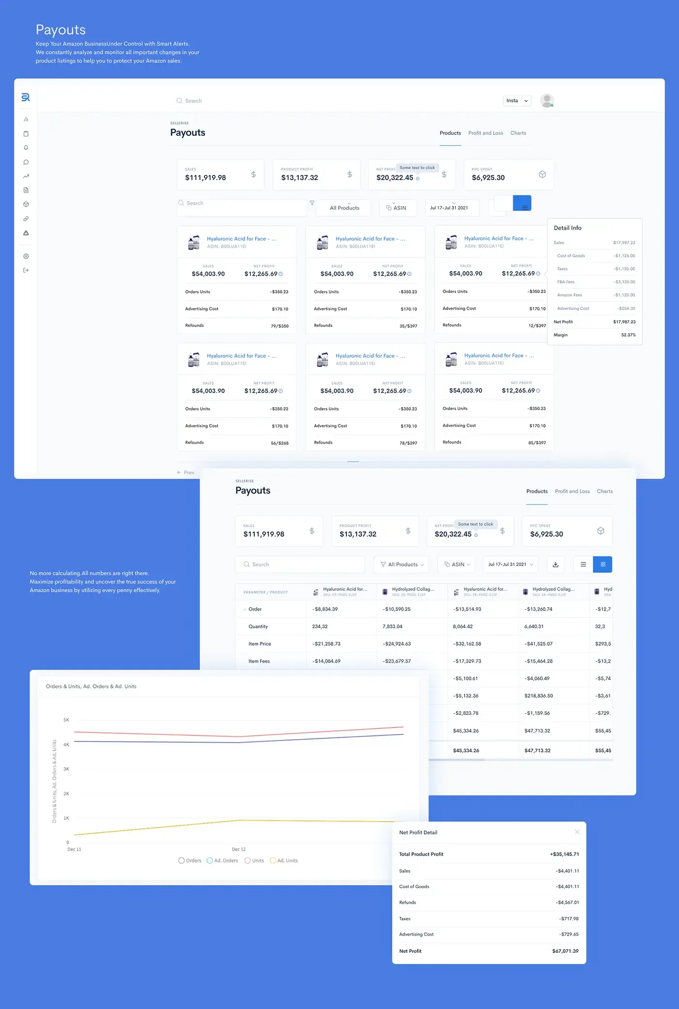
Review dashboard and inventory screens built on the same table pattern.
One extension instead of five
The Chrome extension brings Profit Analyzer and review requests right into Seller Central: a request button on every order, up to 100 requests per page or 10,000 in the background — skipping non-Amazon, refunded and pending orders automatically.
A system for two themes
Tokens, components and table patterns shared by the web app and the extension, in light and dark.
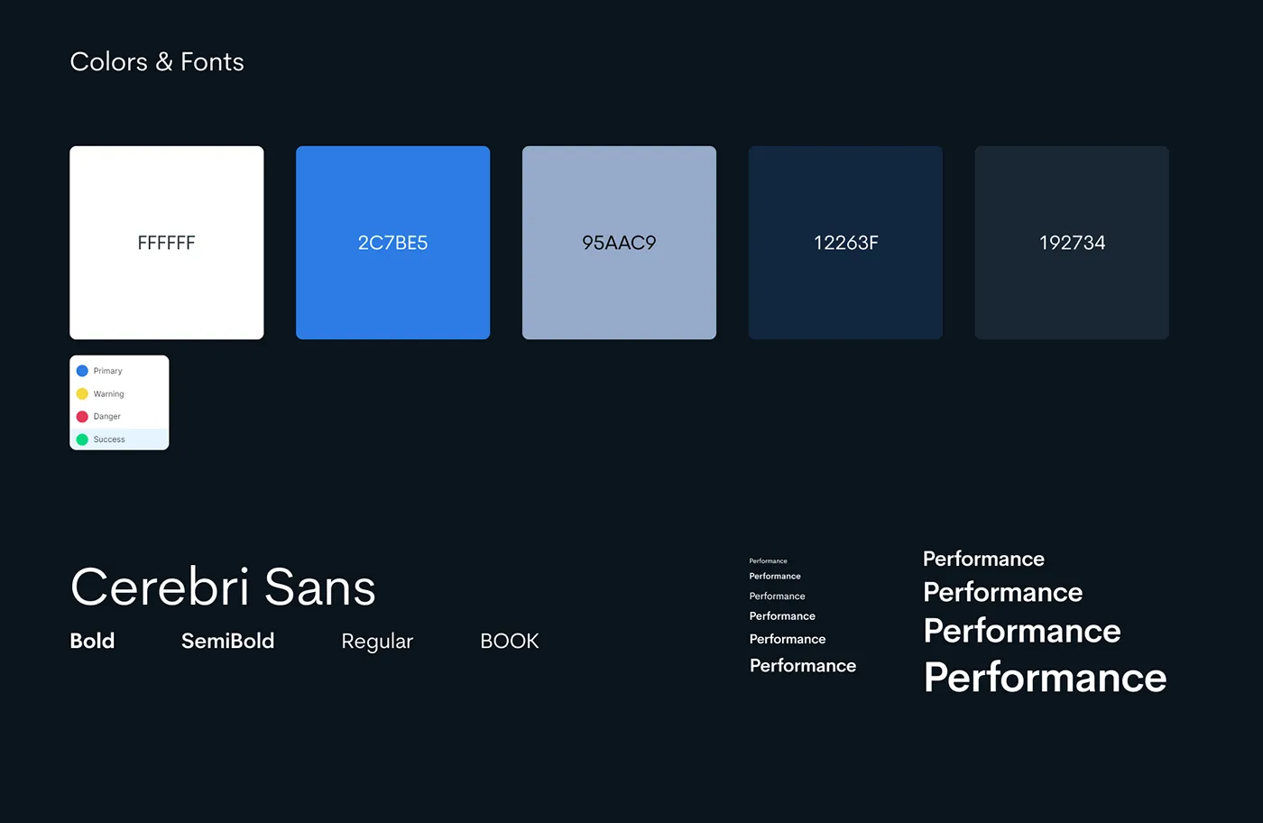
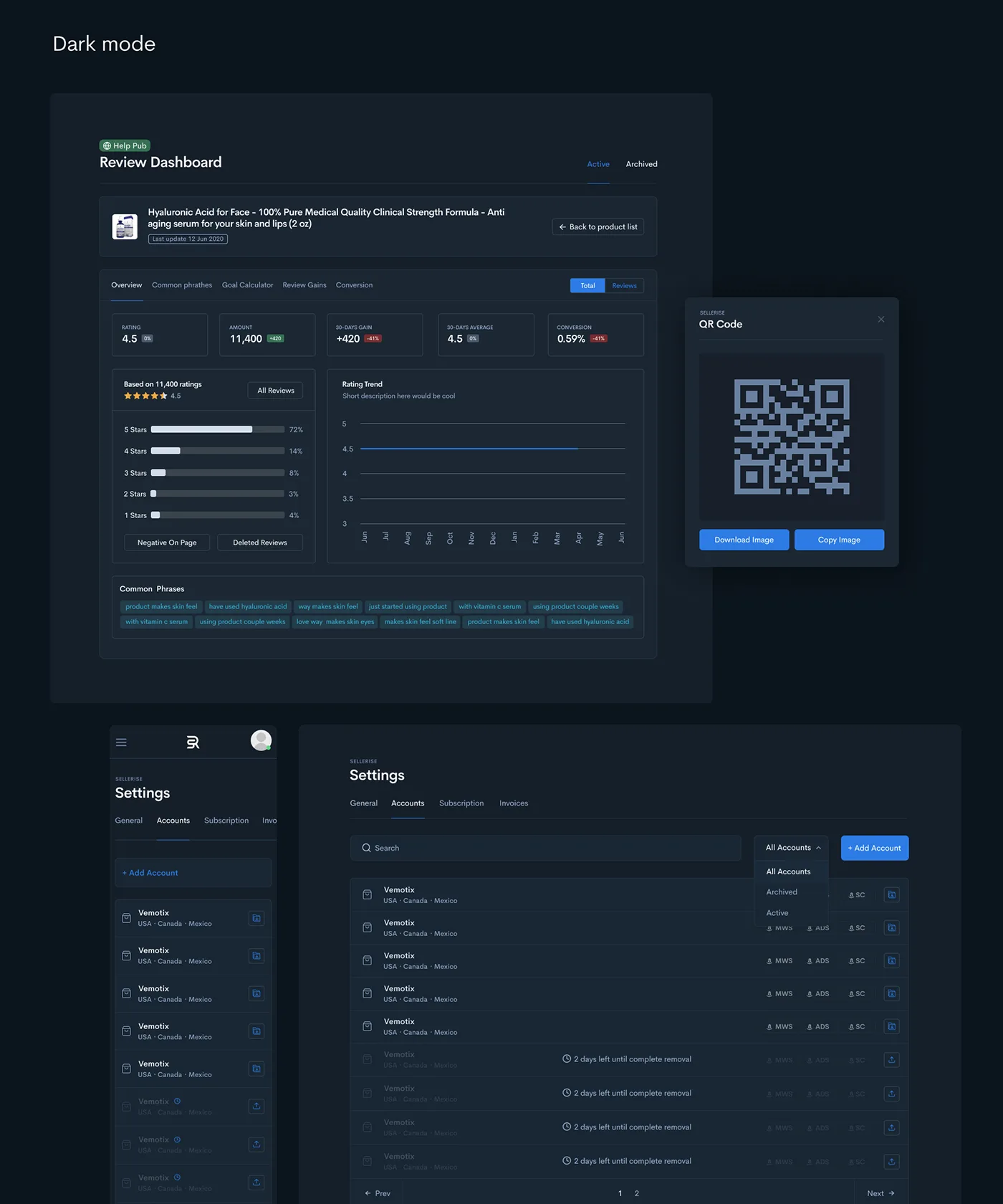
Cerebri Sans, a calm blue palette and a full dark theme.
Results after release
In SaaS, clarity beats visual complexity — and every UX fix shows up in retention.